
RETECHNOLOGY PREMIUM MARKETPLACE RELATED PRODUCTS | WEBINARS | SPECIAL OFFERS


You are viewing our site as an Agent, Switch Your View:
Agent | Broker Reset Filters to Default Back to ListVisual Hierarchy and Your Website
May 27 2014
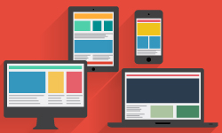 Your website is a tool to communicate with your users. Sometimes, however, we have so much that we want to communicate that the message gets lost along the way. The best way to make sure we are able to communicate our message clearly is by using visual hierarchy in our website.
Visual hierarchy – how you organize and visually prioritize elements on each web page – helps with comprehension and guides users through the story that you want to tell. It shows users what they should look at first, as well as helping them determine if your page has the information they are looking for, and where that information is located. Because of this, when creating or updating your website, visual hierarchy is one of the most important things that you should consider for each page.
For myself, I find that an easy way to determine the visual hierarchy of a web page is by going through the following steps:
- Collect all the content that is going to be on a page (I'm talking everything – all of the text, the images, the calls to action)
- Decide what is most important and relevant for the site's users, then what is next most important, and next, etc. (i.e., a heading is important because the user needs to know what this page is about)
- Decide if the users should do something and what that something is (ie – a call to action is important if you want the user to contact you about information on the page)
So, now that you know what the most important content is, how do you use visual hierarchy to guide users through your content? Below, I've outlined some easy ways that you can create a visual hierarchy.
Position of Elements
Because users will often view the top part of a web page first, you will want the most important element of your web page at the top of the page. This is often a headline that tells the user exactly what this page is about. Less important elements on your website will go further down on your web page.
Imagery
Imagery often catches users eyes very quickly. When used in close proximity to text, this can help increase the visual hierarchy of that text. For example, if you have text corresponding to the image, it often helps to place the text beside, directly below or directly above the image.
You can easily do this through the use of a table and placing the image and text in cells that are either above one another or beside one another.
Size of Elements
Large elements, whether they are text or whether they are images, will often grab the user's attention very quickly, whereas text and imagery that is small will often be one of the last things a user focuses on.
Colour of Elements
The colour of an element, if it contrasts greatly from other elements around it, will often help it jump out at users. For example, if the majority of the text on your website is a black or a dark grey, using a brighter blue or red would increase the visual hierarchy of that element.
Summary
Improving a visual hierarchy for each of your web pages will help to communicate your message to your users. You can easily do this by selecting the most important elements of your content and drawing a user's attention to it in the order that you want them to view it.
These are four really easy ways that you can help improve the visual hierarchy on each of your web pages right now:
- Making sure that the most important elements are at the top of the page
- Using images to draw attention to important content
- Sizing elements so the more important parts are larger
- Adjusting the colour of elements so they stand out from other elements around it.
One last thought to keep in mind when working on the visual hierarchy of each of your web pages: visual hierarchy is meant to help emphasize the most important parts and guide a user through your content. Not every element on each page should be made to look like the most important element on that page.
Used well, visual hierarchy will help communicate your story more clearly with your users.
To view the original article, visit the Lone Wolf blog.